
BSP Blueprint
BSP(Behavioral Styles Profile)Blueprint is a product of PCS-Global, a Michigan local consulting firm, helping teams and leaders better understand themselves and each other, to improve communication and collaboration to drive better outcomes on all front.
We redesigned the BSP experience to simplify assessment and results interpretation and integrated an AI Pocket Coach to provide continuous, context-aware behavioral coaching.
Client
PCS-Global
Scope
Assessment redesign and dashboard design
Role & Contributions
UX research and design
Timeline
Sep - Dec 2025
Problem Statement
How might we redesign the BSP journey for clarity, trust, and usability?
Discovery
Our first phase focused on gathering early insights as the goal was to understand and determine the direction of the project.
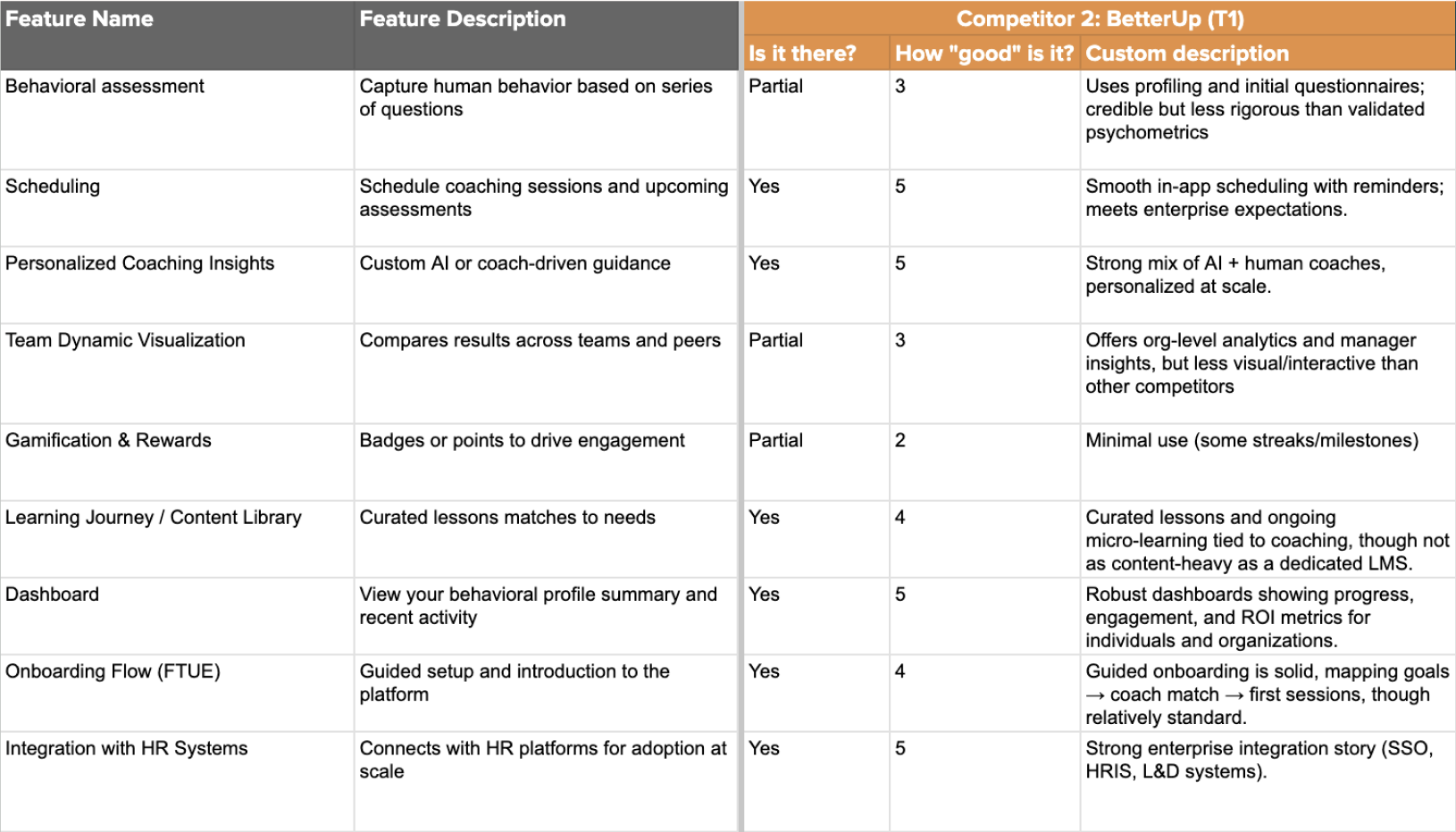
We conducted a competitive analysis to evaluate how BSP-Blueprint’s key features compared to similar platforms and identified opportunities for market differentiation.
We then gained first-hand experience with the product by completing the BSP assessment ourselves and reviewing the results with the client in an introductory session. This helped us understand the current user experience from both an individual and team perspective.
Finally, we defined the project scope by establishing team roles, a client communication plan, and a timeline for key deliverables, ensuring alignment and clarity before moving into the next phase.
Research
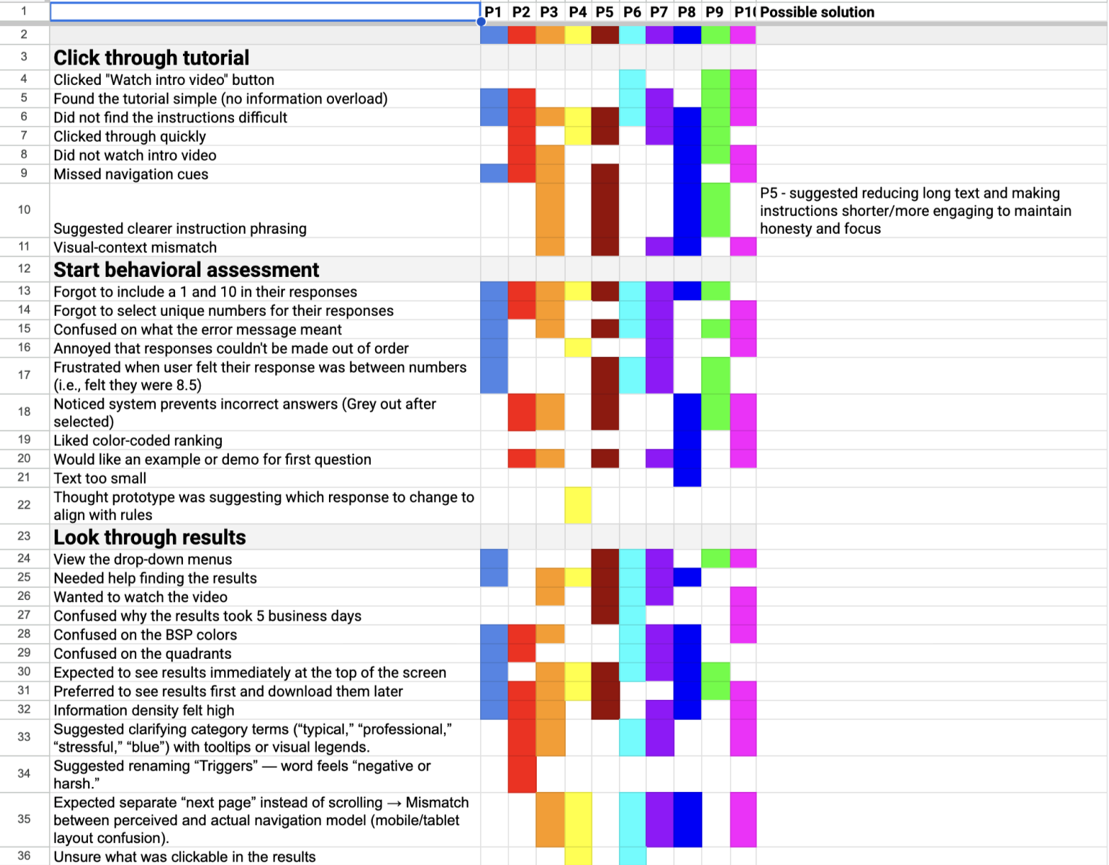
We did 10 moderated semi structured usability test sessions (5 PCS users, 5 first-time users) completing the full BSP assessment using a think-aloud method.
We found 5 insights:
Limited guidance: Users didn’t know how to approach each question
High mental effort: Repetitive statements felt long and tiring
Weak visual hierarchy: Important buttons were easy to miss
Poor error feedback: Users didn’t understand why some choices were “invalid”
Text-heavy results: Insights were difficult to scan and interpret
Insights
The behavioral assessment requires stronger framing to engage users.
Compared to widely adopted personality-based tools, behavioral assessments are less familiar and may not naturally spark user curiosity. This creates a need to clearly explain the purpose, relevance, and benefits of behavioral insights early in the experience to encourage engagement and trust.
Onboarding plays a critical role in reducing friction and building early trust.
Because the product is complex and often introduced in professional contexts, the first-time user experience must balance clarity, approachability, and credibility. A seamless onboarding flow is essential for helping users quickly recognize the platform’s value.
AI is a secondary consideration rather than the core product driver.
Although AI was mentioned in early conversations, the client emphasized that the behavioral assessment itself is the foundation of the platform. Any AI-driven features should support interpretation and usability rather than overshadow the assessment methodology.
We then did affinity mapping to group 70+ observations into four major themes:
Clarity: Users needed simple explanations, examples, and clearer guidance to understand each step.
Navigation: Missing visual cues made users hesitate or miss key actions.
Confidence: Many users doubted whether they were completing the assessment “correctly.”
Information Load: Both the assessment and results felt dense, text-heavy, and hard to digest.
Color Interpretation Issues: Users were confused about what each color represented in the behavioral model, including inconsistent or unclear color meanings.
Task Flow Analysis
We mapped the actual user journey from login > assessment > results to identify breakdowns.
Current Flow Issues:
No pre-assessment onboarding or explanation
Unclear progression indicators
Dense results without hierarchy
No connection from results → coaching (PCS’s core value)
Opportunities:
Add mini tour before the assessment
Introduce progress indicators
Simplify choices and reinforce confidence
Visualize results and link them to coaching actions
Ideation
Using our research insights, we refined assessment guidance, streamlined the dashboard, and added an AI chatbot that serves as both a guide and a personal coach.
Assessment
Clear overview of assessment logistics
Example question walkthrough for confidence
Cleaner visual cues and rule clarity
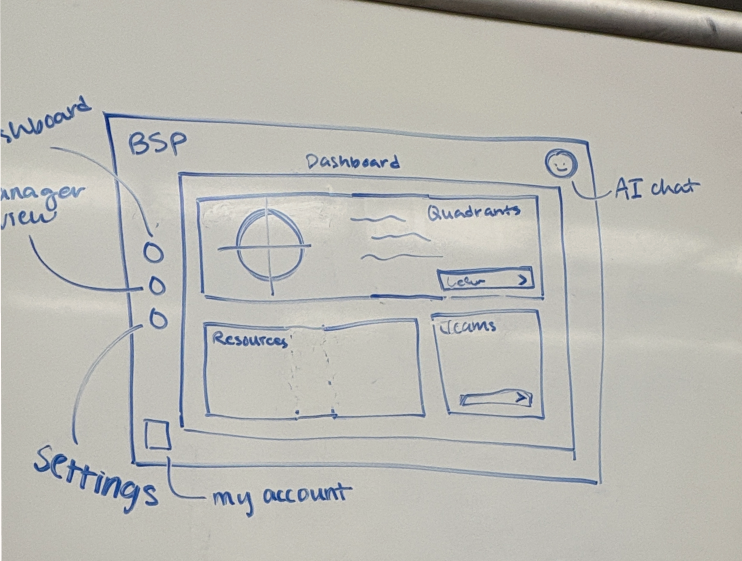
Dashboard
Organized features tailored to user needs
Easier interpretation of BSP results
Manager view with multi-selection and real-time charts
AI Pocket Coach
Chatbot-style guidance on report insights
Actionable tips for building needed skills
Prototype 1
Assessment
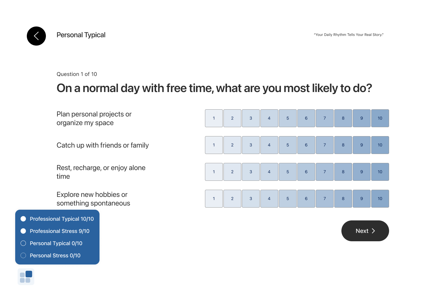
The assessment question has strict rules of selecting 1 and 10 for each set and non-repetitive selections to ensure its accuracy, thus having visual cues to avoid errors is important. Here we initially used the gredients to show the percentage of likeliness. We focused on refining clarity and reducing friction. but testing showed that the blue color carried misleading meaning, the hover states in the progress bar were not obvious enough, and the back button drew too much visual attention compared to the actual task.
Dashboard
The original report presented a long, information-dense scroll that was difficult to digest. To make the content more approachable, we introduced a dashboard with clearly sectionalized information.
However, usability testing revealed that the top navigation and side bar drew too much visual attention, making it unclear where users should focus first. The layout also failed to clearly communicate next steps, and much of the content felt static—losing usefulness as users became more familiar with their results.
Iterated prototype
Assessment Onboarding
Since users often felt unsure about the assessment questions—especially with unfamiliar professional terms—we added short onboarding explanations at the beginning.
Assessment
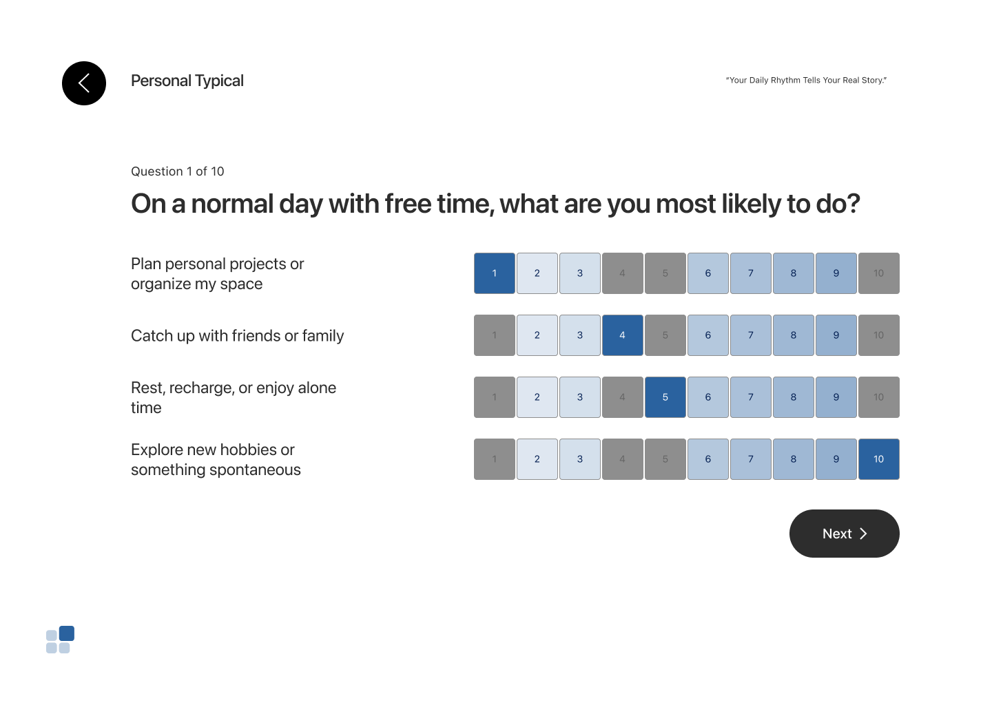
For the assessment experience, we added quadrant context and short introductions to help users mentally organize the behaviors and feel prepared before answering. We simplified the color palette to black and white with yellow as the accent color to reduce cognitive load and improve focus.
We also refined the interaction logic by introducing immediate error feedback. If a user’s first three selections did not include either 1 or 10, an in-time error message appeared, allowing users to correct their choices before moving forward.
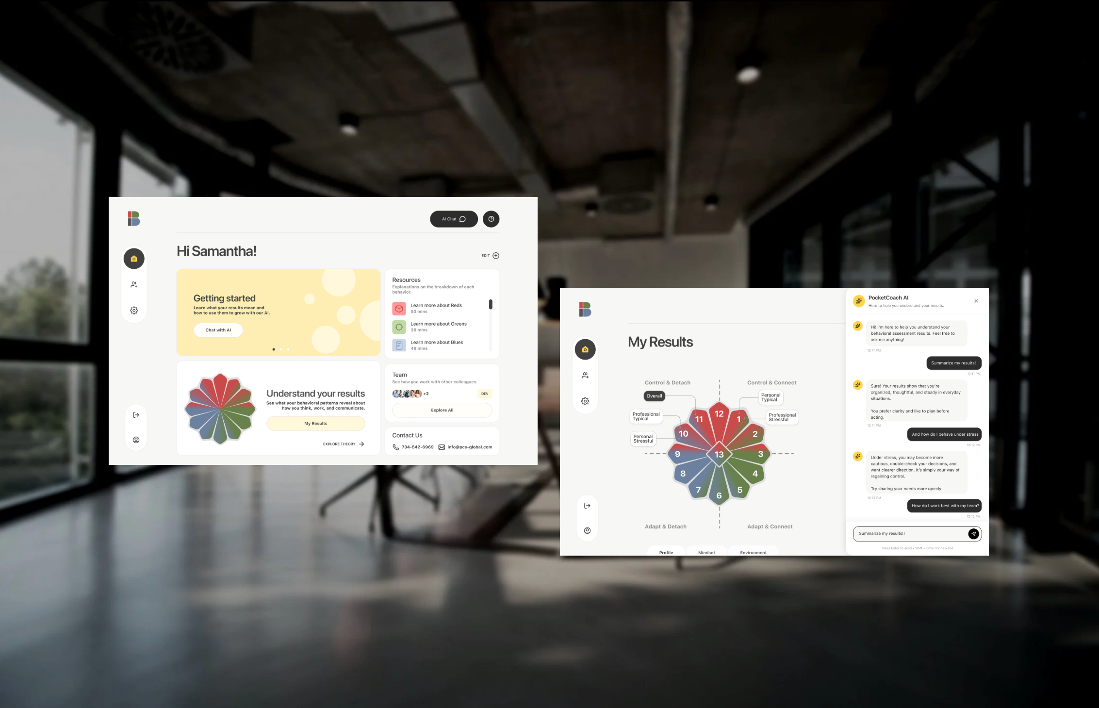
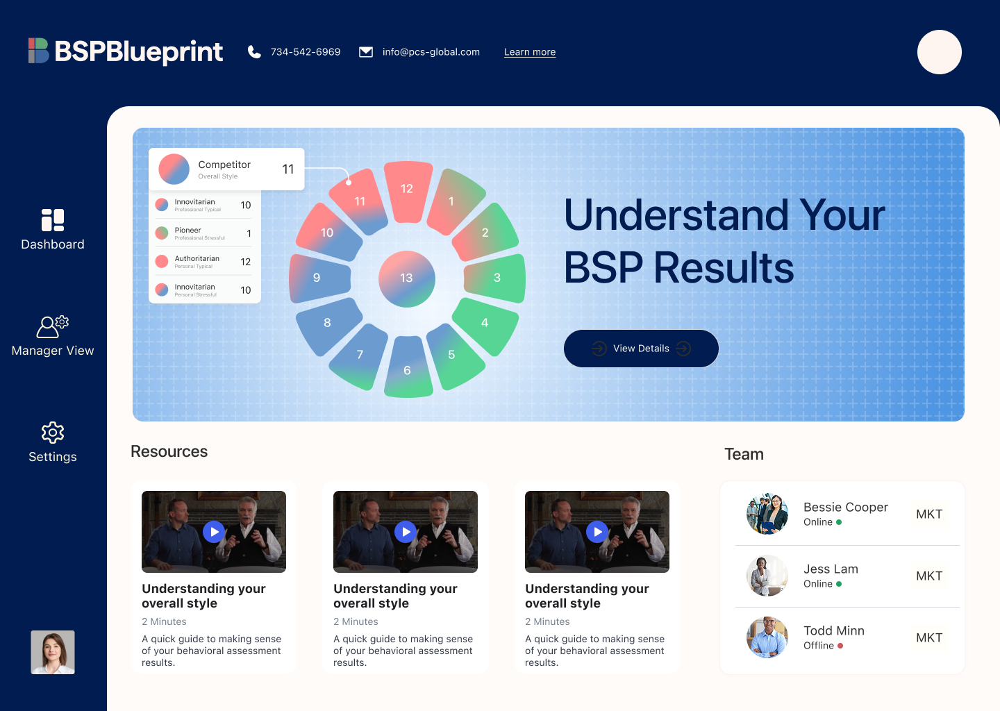
Dashboard
We designed a side navigation that allows users to easily switch between the homepage, team view, and settings. An AI chat button is placed at the top for quick access to search and guided support when questions arise.
All core content is centralized in the main area, creating a clear focal point for dynamic feedback, results review, deeper understanding of the BSP model, and team-related insights. To support ongoing trust and accessibility, we also included a “Contact Us” card so users can easily reach out for additional help.
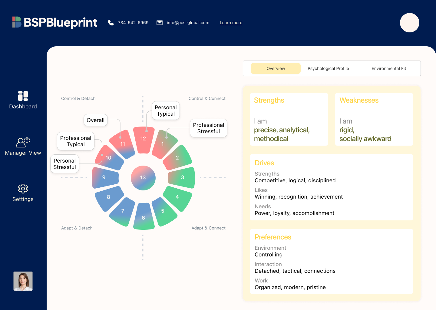
Results Page
For the results page, we focused on improving clarity and helping users better understand what their numbers actually mean. We redesigned the chart to make the proportion of each behavioral type easier to read at a glance, giving users a clearer picture of their overall pattern.
On the right side, we reorganized the report details into a tabbed structure, allowing users to explore their profile, mindset, and environment. Expandable sections provide deeper information on demand, reducing cognitive overload while maintaining access to detail.
This structure makes the results more digestible, interactive, and supportive for both first-time and returning users.
Team view
Our research showed that users struggled with clarity, navigation, and interpreting what the data meant. In response, we redesigned the Team View to make team-level insights easier to explore and understand.
Users can select individuals within their organization and generate visual graphs that reveal how team members work and interact with one another. Following familiar spreadsheet patterns, the view also supports filtering, grouping, sorting, and sharing—allowing users to analyze and communicate insights in ways that feel intuitive and efficient.
AI Pocket Coach
The AI Pocket Coach lives in a right-side panel and is designed as a supportive, private space where users can ask questions and comfortably explore their results. It provides real-time guidance to help users interpret their data without feeling overwhelmed.
Over time, the coach learns from user interactions, allowing it to personalize responses and support long-term engagement. To make the experience beginner-friendly, we included starter prompts—such as requesting a short summary of results—so users can quickly grasp key insights without reading lengthy PDF reports.
For managers and HR partners, Pocket Coach also supports understanding team dynamics and improving collaboration across the workplace. Throughout the experience, the AI remains fixed and easily accessible, acting as a constant sidekick so users never feel lost.
What I learned
Cleaner hierarchy and lighter UI consistently performed better
Users preferred modern, intentional designs that reduced visual clutter and cognitive overload.
Reduced ambiguity led to higher trust
Clear labels, explicit workflows, and predictable interactions helped users feel more confident interpreting their data.
Team comparison requires strong structure
Multi-person comparison is essential for leadership and HR use cases, but it must remain clearly organized to stay usable.