Spoonbill Books Redesign
Visual Identity
Spoonbill & Sugartown Books is a beloved local bookstore in Williamsburg. This project is dedicated to the store and focuses on a brand revival that reimagines its identity in a more contemporary way while preserving its original spirit.

Why Spoonbill?
The name stood out to me from the very beginning because of how unusual and memorable it is. After researching the bookstore’s history, I learned that what makes this small shop special is its highly curated selection. Every book is hand-picked by the owners from around the world, offering a thoughtful alternative to algorithm-driven recommendations, with a strong sense of human touch and warmth.
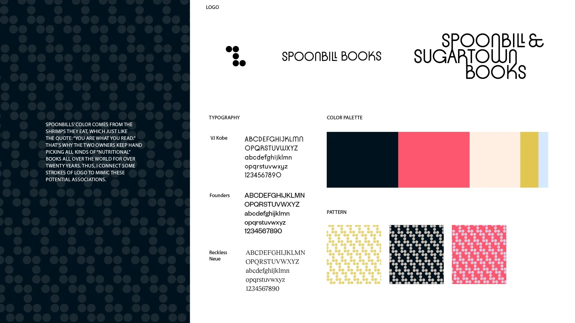
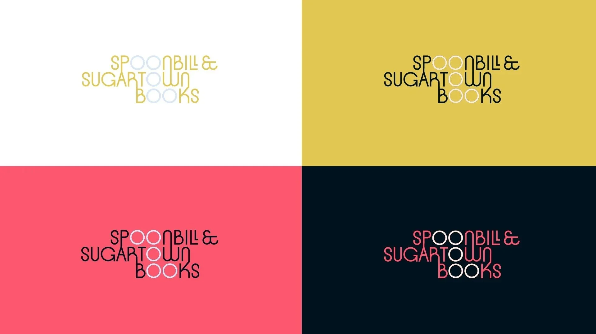
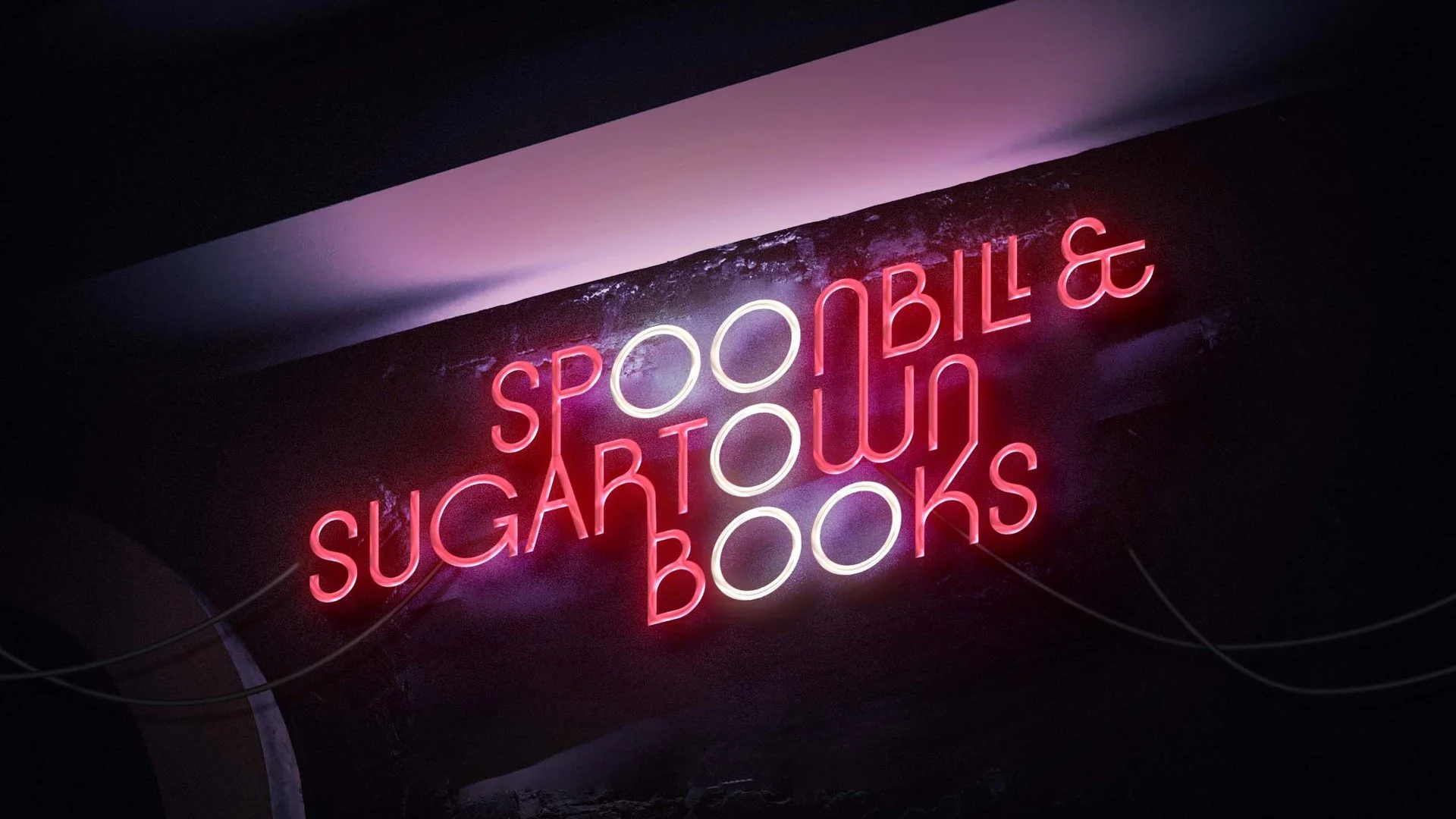
Spoonbills are known for their pink feathers, which come from the shrimp they eat. The nutrients from their diet influence their appearance. This characteristic connects closely to the idea behind the bookstore: you are what you read. To emphasize the relationship between good books and great minds, I refined the logo by allowing the strokes to remain continuously connected, forming a network-like structure that represents knowledge.
The color palette is inspired by the natural habitat of the spoonbill. Magenta and pink reference the shrimp and the bird’s feathers, while blue and green are drawn from water and algae. The icon design is abstracted from the letter “O,” subtly echoing the spoonbill’s shape while maintaining a typographic connection to the brand.